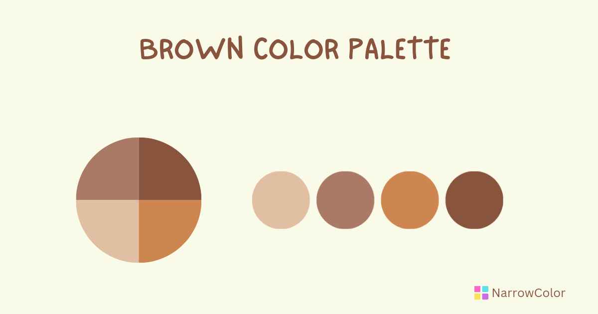
Brown Color Palette: A Guide for Designers
By NarrowColor, 06 January, 2023
Color is one of the most important element in a design. It can make a big impact on the look of a design. Choosing the right color palette for designs is an essential and logical task. If you choose the wrong color, then look of your project will be bad and unpleasant. In today's article, we'll focus on the psychology of color brown, its different shades and how to choose the right brown for your designs.

I. Introduction
In designing website, logo and interior design, the right color can make the success of the project. Otherwise it can break the success. So something should be said about brown color too.
II. History of brown in design
In design, the color brown has a long history dating back to the 20th century. During that time, brown color was a popular choice for luxury goods and branding, and it remains associated with composure and elegance today.
The color brown in the late 20th century became common symbol for simple, natural, strength, isolation and healthy.
Famous designers Coco Chanel and Ralph Lauren have incorporated brown into their work. They used it as a base color for their collections and branding.
III. Types of brown
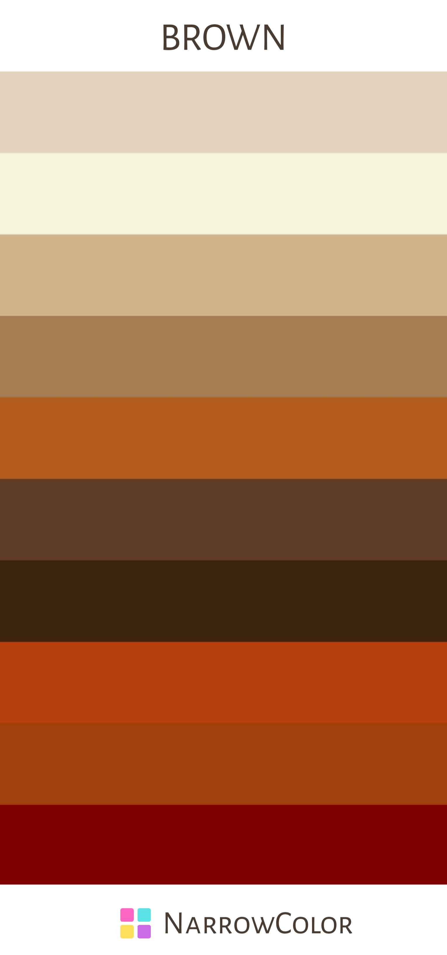
There are many shades of brown you can choose. It can be produced by combining yellow, red and black. Here are a few popular shades of brown and their hex codes:
- Light brown: #E5D3C0
- Beige: #F5F5DC
- Tan: #D2B48C
- Caramel: #A67C52
- Chestnut: #B35C1E
- Mocha: #5F3D26
- Chocolate: #3B240B
- Rust: #B7410E
- Sienna: #A0410D
- Maroon: #800000
When you select a shade of brown for your design, consider what you want to achieve. Darker shade of brown color is symbol of depth and drama. And lighter shade can create a warm and inviting atmosphere.
IV. Using brown in design
Brown can be used in a variety of design contexts. You can use it for branding, logos, website design and interior designs.
Here are some examples that will be helpful to incorporate brown into your design:
1. Background And Typography
In design, the shades of brown is commonly used as a background or base color. It's also seen in wood grain textures. The brown color helps bring a feeling of wholesomeness and warmth to the designs. Sometimes, it is used in its darkest forms as a substitute for black, either in typography and background.
02. Website design
You can use brown shades for backgrounds, fonts and graphics to create a cohesive look for your website. It will be a good choice for your website design.
03. Interior design
You can add warmth to a room by using shades of brown. You can easily do this by adding colors for furniture, accents, and decor.
Remember, when you use brown color in your designs, be sure which color you are pairing it with. This has a huge impact in your designs. So, choose your accents wisely.

V. Conclusion
Overall, the brown color palette is a versatile choice for any design. Don't be afraid to experiment with different shades and pairings to see what works best for your project.
I hope this blog post "Brown Color Palette: A Guide for Designers" is helpful. Please share it with your friends and family.
Thanks :)
FAQs
1. What is the color psychology of brown?
Brown color represents natural, simplicity and security. It's usually associated with earthiness, probably this is because of its earthy tones.
2. What are the shades of brown?
The shades of brown are: Dark Brown #654321, Chestnut #954535, Sepian #704214, Mocha #6F4E37, Cocoa #D2691E, Taupe #483C32, Beige #F5F5DC, Cream #FFFDD0 and Sand #C2B280.
3. What are the primary colors of brown?
The primary colors of brown are red, yellow and black (or blue). When these mixed together, make brown color.
